Saturday, March 28, 2015

*** ক্যারিয়ার গড়ুন গ্রাফিক ডিজাইনে ***

গ্রাফিক্স ডিজাইন বর্তমান সময়ে একটি জনপ্রিয় পেশা। এ কাজটি একই সাথে আনন্দদায়ক এবং সৃজনশীল। যদি আপনার মাঝে ক্রিয়েটিভিটি থাকে আর স্বাধীনভাবে কাজ করতে চান তাহলে গ্রাফিক ডিজাইনার হিসেবে গড়ে তুলতে পারেন নিজেকে। বিস্তৃত কর্মক্ষেত্র আর তুমুল চাহিদা থাকার কারণে একজন প্রফেশনাল গ্রাফিক ডিজাইনারের গ্রহণযোগ্যতা খুবই বেশি। তবে নিজেকে আন্তর্জাতিক মানের ডিজাইনার হিসেবে প্রতিষ্ঠিত করতে চাইলে পাড়ি দিতে হবে দীর্ঘ পথ, জানতে হবে নিত্য-নতুন কলা-কৌশল।
** গ্রাফিক্স ডিজাইন কি?
সহজ কথায় বললে গ্রাফিক্স ডিজাইন হল এমন একটি প্রক্রিয়া যার মাধ্যমে যে কোন তথ্য বা ছবি শৈল্পিক উপায়ে উপস্থাপন করা হয়। একজন ডিজাইনার তার কাজের মাধ্যমে খুব সহজেই ব্যবহারকারির মধ্যে প্রভাব ফেলতে পারেন এবং সংক্ষিপ্ত ও নান্দনিক উপায়ে তথ্য পৌঁছে দিতে পারেন।
** যা জানতে হবেঃ
গ্রাফিক ডিজাইনার হওয়ার জন্য আপনাকে গ্র্যাজুয়েট হওয়ার প্রয়োজন নেই তবে ইংরেজিতে মোটামুটি দক্ষতা থাকলে অনেক ভালো করতে পারবেন। অনলাইনে ঘাঁটাঘাঁটি কিংবা বিদেশি বায়ারের সাথে যোগাযোগের জন্য ইংরেজি জানা একটি পূর্বশর্ত। এ ছাড়া কম্পিউটার অপারেট করা জানতে হবে অর্থাৎ বেসিক কম্পিউটিং সম্পর্কে ধারণা থাকা আবশ্যক। ইন্টারনেট সংযোগ থাকলে খুবই ভালো হয়; তাহলে আপনি যে কোন বিষয়ে অনলাইন থেকে সাহায্য নিতে পারবেন। ডিজাইনের কাজের জন্য প্রয়োজন ইমেজ এডিটিং সফটওয়্যার যেমন অ্যাডোবি ফটোশপ, অ্যাডোবি ইলাস্ট্রেটর প্রভৃতি। যদি আপনার মন হয়ে থাকে সৃজনশীল অর্থাৎ আপনার যদি আঁকাআঁকি করতে ভালো লাগে তাহলে সেটা অবশ্যই প্লাস পয়েন্ট।
** কিভাবে শিখবেনঃ
# ভালো প্রতিষ্ঠানে প্রশিক্ষণ নেয়া (জরুরী না)।
# প্রতিষ্ঠিত ডিজাইনারের অধীনে কাজ করা
# অন্যের কাজ অনুসরণ করা
# অনলাইনে সার্চ করা(গুগল,ইউটিওব ইত্যাদী)
# মানসম্মত টিউটোরিয়াল দেখা
** গ্রাফিক্স ডিজাইনারের কাজের ক্ষেত্র
যে কোন পণ্য বা সার্ভিসের প্রচারণার জন্য দৃষ্টিনন্দন ও আকর্ষণীয় ডিজাইনের বিকল্প নেই। তাই ডিজাইনারকে কাজ করতে হয় মানুষের বয়স, আচার-আচরণ, পেশা, চাহিদা প্রভৃতি দিকগুলো বিবেচনা করে। আগেই বলা হয়েছে গ্রাফিক্স ডিজাইনারদের কাজের ক্ষেত্র বিস্তৃত। তবে সাধারণভাবে গ্রাফিক ডিজাইনের যেসব ক্ষেত্র বিদ্যমান তা হলঃ
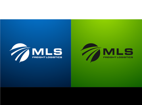
# লোগো তৈরিঃ
লোগো হচ্ছে একটি কোম্পানির পরিচয় বা ব্র্যান্ড। লোগোর মাধ্যমে একটি প্রতিষ্ঠানকে চেনা যায় খুব সহজেই। বিশ্বের নামকরা ব্র্যান্ড অ্যাপল, স্যামসাং, গুগল কিংবা ফেইসবুক এবং বাংলাদেশের ব্র্যান্ড আড়ং, গ্রামীণফোন, প্রাণ কিংবা প্রথম আলো শুধুমাত্র তাদের লোগো দেখেই চিনতে পারা যায়। মানসম্মত দৃষ্টিনন্দন লোগো কিন্তু একজন গ্রাফিক ডিজাইনারকেই তৈরি করতে হয়। শুধু প্রতীক নয় লোগোর সাথে কালারিংও ব্র্যান্ডিং এর ক্ষেত্রে ভূমিকা রাখে। লোগো যেমন লোকাল বিজনেসে প্রয়োজন হয় তেমনি তা অনলাইনেও বহুল চাহিদা সম্পন্ন একটি বিষয়।
# ওয়েব ডিজাইনঃ
এটা বলার অপেক্ষা রাখে না যে অনলাইন উৎকর্ষের এই যুগে ওয়েবসাইটের চাহিদা ও প্রয়োজনীয়তা কতটুকু। বর্তমানে শিক্ষা প্রতিষ্ঠান থেকে শুরু করে সামাজিক সংগঠন এমনকি ব্যক্তিগত ওয়েবসাইটও অনেকে তৈরি করতে চান। আর ব্যবসার প্রসারে ওয়েবসাইট অতি প্রয়োজনীয় একটি হাতিয়ার। ওয়েবসাইট ডিজাইনের জন্য একজন গ্রাফিক ডিজাইনারের ভূমিকা খুবই গুরুত্বপূর্ণ। সুদৃশ্য বাটন তৈরি, ব্যানার তৈরি, ইমেজ এডিটিং, আইকন তৈরি প্রভৃতি কাজ করা ছাড়াও একজন গ্রাফিক ডিজাইনার পিএসডি টেম্পলেটের মাধ্যমে একটি সম্পূর্ণ ওয়েব সাইটের আর্কিটেকচার তৈরি করতে পারেন।
# ভিজিটিং কার্ড তৈরিঃ
ডিরেক্ট মার্কেটিং বা ব্র্যান্ডিং এর জন্য ভিজিটিং কার্ডের গুরুত্ব অপরিসীম। ব্যক্তি এবং প্রতিষ্ঠান উভয়েরই পরিচিতি বৃদ্ধির জন্য ভিজিটিং কার্ড জনপ্রিয় একটি মাধ্যম। ভিজিটিং কার্ডের পরিসর ছোট হওয়ার কারণে এখানে ডিজাইন করতে হয় সুন্দরভাবে যাতে সংক্ষেপে ব্যক্তি বা প্রতিষ্ঠানকে ফুটিয়ে তোলা যায়। ভিজিটিং কার্ড গ্রাফিক ডিজাইনের একটি অন্যতম ক্ষেত্র। লোকাল মার্কেটেই শুধু নয়, অনলাইনেও আপনার ডিজাইনকৃত ভিজিটিং কার্ড সেইল করে আয় করতে পারবেন।
# বিজ্ঞাপন তৈরিঃ
পন্যের প্রচারণার জন্য বিজ্ঞাপন সবচেয়ে বড় মাধ্যম। সংক্ষিপ্ত অথচ তথ্যপূর্ণ, নান্দনিক এবং বিনোদনমূলক বিজ্ঞাপন ক্রেতাদের দৃষ্টি আকর্ষণ করে সহজেই। একজন গ্রাফিক ডিজাইনারের সৃজনশীলতা ও দক্ষতার উপর নির্ভর করে একটি বিজ্ঞাপন আবেদন তৈরি করতে পারবে কিনা। বিজ্ঞাপন প্রচারের জন্যও রয়েছে নানা মাধ্যম। অনলাইন, প্রিন্ট কিংবা ইলেকট্রনিক মিডিয়া যেখানে প্রচারের জন্যই হোক সবরকমের দক্ষতা একজন গ্রাফিক ডিজাইনারের থাকতে হবে।
এর বাইরেও ব্রশিয়র ডিজাইন, পোস্টার ডিজাইন, টি-শার্ট ডিজাইন সহ রয়েছে আরও অনেক ক্ষেত্র। শুধুমাত্র একটি ক্ষেত্রে দক্ষতা অর্জন করে শুরু করতে পারেন ডিজাইনার হিসেবে আপনার ক্যারিয়ার।
** কোথায় জব পাবেনঃ
- অনলাইন মার্কেট প্লেইস (সবচেয়ে বেশী টাকা ও জব পাওয়া যায় অনলাইন মার্কেট প্লেইসে)
- বিজ্ঞাপন নির্মাতা প্রতিষ্ঠান
- পত্রিকা/ম্যাগাজিন/প্রকাশনা প্রতিষ্ঠান
- প্রিন্টিং এবং ডিজাইনিং প্রতিষ্ঠান
- ওয়েব ডেভেলপিং প্রতিষ্ঠান
যেসব বিষয়ে আপনাকে যত্নবান হতে হবেঃ
->ভালো প্রতিষ্ঠান থেকে যথাযথ প্রশিক্ষণ নেয়া ( যদি প্রয়োজন হয়)।
->নিজে থেকে কিছু করার চেষ্টা করা (ক্রিয়েটিভিটি)
->নিজেকে আপ-টু-ডেট রাখা
->নিয়মিত ইউটিউব ও গুগল থেকে টিউটরিয়াল ও ব্লগ দেখা।
->প্রতিষ্ঠিত ডিজাইনারদের কাজ অনুসরণ করা
->কাজের স্যাম্পল/টেম্পলেট তৈরি করে রাখা
->মার্কেটিং করা
যারা এখনো ভাবছেন কি করা যায়, দ্বিধা-দ্বন্দে দিন কাটাচ্ছেন তারা নিঃসন্দেহে শুরু করে দিন গ্রাফিক্স ডিজাইন শেখার কাজ। দেশে বিদেশে আপনার জন্য কাজের ক্ষেত্র প্রস্তুত। উচ্চমানের চাহিদা সম্পন্ন একটি প্রফেশন হচ্ছে গ্রাফিক ডিজাইন।

Illustrator

From Wikipedia, the free encyclopedia
For the software, see Adobe Illustrator.
Jessie Willcox Smith 's 1923 illustration of the characters in Alice in Wonderland
An illustrator is an artist who specializes in enhancing writing or elucidating concepts by providing a visual representation that corresponds to the content of the associated text or idea. The illustration may be intended to clarify complicated concepts or objects that are difficult to describe textually, which is the reason illustrations are often found in children's books.[1]

Techniques

A watercolor, by John Simmons, depicting Hermia and Lysander, from A Midsummer Night's Dream (1870)
Some traditional illustration techniques include watercolor, pen and ink, airbrush art, oil painting, pastels, wood engraving, and linoleum cuts. John Held, Jr. was an illustrator who worked in a variety of styles and media, including linoleum cuts, pen and ink drawings, magazine cover paintings, cartoons, comic strips, and set design, while also creating fine art with his animal sculptures and watercolor, many established illustrators attended an art school or college of some sort and were trained in different painting and drawing techniques. Universities and art schools offer specific courses in illustration (for example in the UK, a BA (Hons) Degree) so this has become a new avenue into the profession. Many illustrators are freelance, commissioned by publishers (of newspapers, books, or magazines) or advertising agencies. Most scientific illustrations and technical illustrations are also known as information graphics. Among the information graphics specialists are medical illustrators who illustrate human anatomy, often requiring many years of artistic and medical training.
A particularly popular medium with illustrators of the 1950s and 1960s was casein, as was egg tempera. The immediacy and durability of these media suited illustration's demands well. The artwork in both types of paint withstood the rigors of travel to clients and printers without damage.

Friday, March 27, 2015

Exporting Illustrator Files

To use an Adobe Illustrator file in another application, you often need to export it in a format that another application recognizes as a valid. You could rasterize an a piece of vector artwork and export it as a JPEG image into Photoshop, for instance. One thing this would allow for, is the application of bitmap image filters to your artwork.
To export an Illustrator file in another format choose File>export, and then choose the kind of file you want to export your artwork as.

• Saving and exporting files

Adobe Illustrator not only allows you to save your artwork, but also allows you to export your artwork as a file type that can be used in other applications. Use the save command to save files in their native Illustrator format, use the Save, Save As or Save as Copy commands. To save an Illustrator document in other file formats, you must use the export commands.
Saving illustrator files- There are several ways to save files: The Save command saves the file with its current name, location, and file format. The Save As command lets you save an alternate
version of the file with a different name, location, or file format. The Save a Copy command saves an identical copy of the file, with the word copy added to the file name.

Painting in illustrator

 Paint attributes
You have now learned the basic tools for making Illustrator artwork, but creating and manipulating the shape of paths is only half of the experience. Adobe Illustrator also offers you the opportunity to apply paint attributes to any object that you create.
Painting In Illustrator is accomplished in the following way: Select the object you wish to paint. Next select either the stroke or fill boxes in the color box, or the toolbox. Finally, edit the stroke or fill color using the color pallet, (edit gradients using the gradients pallet,) and apply the "paint".

Illustrator Viewing artwork

 Scrolling hand tool- By selecting the hand tool you have the ability to drag an image anywhere on the artboard, or into the scratch area.
 Zoom tool- The Zoom in/Zoom out tool allows you to enlarge or decrease the view of your artwork. Once the tool is selected you can click on any area you wish to zoom in on
 Moving, rotating, scaling, free transform- All of these can be done with the move scale and rotate tools in the tool box
 Choose view- To make your document fit inside the monitors window choose View>Fit In Window. To display it at actual size choose View>Actual Size
 Create view- Choose View>New View and enter a name for the view. To access the view go to the view menu.

FRANCE 1-3 BRAZIL


Full time Good win for Brazil. Another step on the path towards rebuilding their public's faith in them and their credibility.
90+3 min Start the car. Get you coats. Call the cops. It's time to call it a day now. All the air has been let out of the balloon by these substitutions. Though it was entertaining while it lasted (for about 75 minutes).
90+2 min There'll be four minutes to fill up with spurious substitutions - and here comes Marcelo for Elias.
90 min Fernandinho replaces Luiz Gustavo. Lucky lad.
89 min Dunga takes off Roberto Fermino and gives Luiz Adriano a gallop.
88 min Now Fekir works himself an opening after Benzema clips a pass to the right edge of the box. Fekir takes a touch with his left foot, then another and screws a shot from 18-yards past Jefferson's right post.
86 min Oscar gets a rest. Souza replaces him after Fekir was brought down by Filipe Luis though the ref told the Lyon prodigy that he believed it a dive. That was poor judgment. How will he sleep?
85 min It's all gone a bit stale. France are trying but are being stymied by Brazil's disciplined tracking and firm tackling.
83 min Giroud comes on for Matuidi and for Brazil Douglas Costa for Willian.
82 min Enter Payet. Exit Valbuena.
80 min Benzema is determined to score to mark his captaincy and has two bites at a shot when the original is blocked. To no avail.
77 min Neymar cruises in from the left towards the D on a diagonal run after Schneiderlin gives up the ghost. His last touch of the dribble takes the ball over a divot that makes it sit up so when he shoots it lifts far higher than he expected and goes in a tame arc high over the crossbar. He curses the pitch and the man who mowed it.
75 min Fekir's contribution is to win a foul, wide on the left, that will give Valbuena a chance to spin in a cross. He takes it and plonks it over everyone's head and out for a goalkick.
73 min France's first subs - Kondogbia for Sissoko and Fekir for Griezmann.
72 min Well, well. Time for some changes, surely Didier?

International Match RFK Memorial Stadium 27th March 2015 - Kick off 15:00 El Salvador & Argentina


GOAL! FRANCE 1-1 BRAZIL (Oscar) Half time


  • Oscar gets Brazil on level terms after a fine move with Roberto Firmino 
  • Raphael Varane scores a header from a corner in the 21st minute 
  • France starting XI: Mandanda, Sagna, Sakho, Varane, Evra, Matuidi, Schneiderlin, Sissoko, Griezmann, Valbuena, Benzema 
  • Brazil starting XI: Jefferson, Danilo, Thiago Silva, Miranda, Filipe Luis, Luiz Gustavo, Elias, Willian, Oscar, Firmino, Neymar


  • Brazil vs. France 2015: TV Channel, Live Stream Info And Team News For International Friendly

    One of the world’s great rivalries will get another airing on Thursday when France host Brazil in a friendly at the Stade de France. Both the venue and the teams will be the same as for the 1998 World Cup final when France humbled Brazil 3-0 to lift the trophy for the first time, in a match that will forever be remembered for the mystery surrounding the exclusion and then reinstatement in the starting lineup of Brazilian striker Ronaldo.
    The current coaches of both teams captained their countries that night on the outskirts of Paris, and are now charged with returning them to a position at the top of the sport. For Didier Deschamps, the specific goal is to put France in a position to lift the European Championship next year on home soil. At last year’s World Cup, France rebuilt their reputation after the in-camp turmoil that precipitated a group-stage exit in 2010, but they still ultimately went out limply to Germany in the quarterfinals. Since returning from Brazil, though, they have gone unbeaten in friendlies, and picked up impressive wins over Spain and Portugal.
    “We've been playing good games and we showed that we can suffer and win,” France striker Karim Benzema said, reports BBC Sport.
    The tasked faced by Brazil coach Dunga, despite his side going one round further in the World Cup, is a far more arduous and pressurized one. The former midfield anchorman was a surprise and largely unpopular appointment when he was chosen to take charge of Brazil for a second time in the wake of a humiliating 7-1 defeat to Germany on home soil. After a match which exposed a long decline in a team once beloved the world over, many sought someone to return the fluidity and joy to the national team. Instead Dunga selected, despite having coached the team to the 2010 World Cup with a style that mirrored the no-thrills approach he demonstrated during his playing days.
    But he has been able to silence some of his critics, thanks to six wins from six matches since taking charge. Most impressive of all was a 2-0 win over World Cup finalists Argentina last October, which is likely to have been a particular boost for confidence ahead of this summer’s Copa America and World Cup qualifiers that begin soon after. And Deschamps insists he is expecting Brazil to provide a stern test for his France team.
    “They are reeling from a World Cup that was not unsuccessful despite the trauma they went through -- they were still in the semi-finals,” he said, according to Reuters. “I have seen what they have been doing since then and I saw many, many very good things.”
    Fresh from his win with Barcelona in El Clasico, Neymar will be the star attraction for Brazil, and he could be joined in attack by first-time starter Roberto Firmino. The Hoffenheim forward came off the bench to score Brazil’s winner against Austria last November. France, meanwhile, will be missing first-choice goalkeeper Hugo Lloris and midfielder Paul Pogba, but could hand a debut to Nabil Fekir. The in-form Lyon attacking midfielder has chosen to play for Les Bleus ahead of Algeria.

    Thursday, March 26, 2015

    Working in layers Illustrator


    •Working in layers
    Illustrator's layers allow you to simplify your work. With layers, you can modify, edit, hide or delete one layer of content while the other layers remain intact.
     Open the Layers palette by choosing Show Layers from the Window menu
     Click on the name of the layer you want to work on. This layer becomes current.
     Know that you can create a new layer by clicking on the layer icon on the bottom of the Layers palette.
     Understand that you can name the layer by clicking on the arrow at the upper right corner of the palette.
     Realize that you can delete a layer by selecting it, then clicking on the trash can icon at the bottom of the Layers palette.
     Know that you can make a layer invisible by clicking on the eye icon that appears on the left side of each layer. To restore visibility, click on the space where the eye icon used to be.
     Understand that you can move objects between layers by cutting and pasting, or you can select the object and drag it to the Layers palette. Release it on the layer that you want to use.
     Know that you can relocate layers by clicking on the layer to be moved and dragging it to its new location in the Layers palette.
     Realize that when you're finished, you can flatten your artwork into one layer by selecting the layer that you want to use and choosing Flatten Artwork from the Layers palette.

    Everything is Design: The Work of Paul Rand

    My New Logo

    Learn the Basics of Photoshop The Toolbar

    We're not going to take a look at every single tool but we are going to look at almost every one of them.
    While this overview will give you an idea of what each tool does, go find yourself a photo and start playing
    around with them.

    Move Tool (Keyboard: V)

    The move tool simply lets you move objects in a given layer around the Photoshop canvas. To use it, click
    anywhere on the canvas and drag. As you drag, the Photoshop layer will move with your mouse.

    Marquee (Keyboard: M)

    The marquee lets you select part of the canvas in a specific shape. By default you get a rectangular (or
    perfect square if you hold down shift while selecting), but you can also select in the shape of an ellipse (or a
    perfect circle if you hold down shift while selecting).

    Lasso (Keyboard: L)

    The lasso is a free-form selection tool that lets you drag around the canvas and select anything the lasso'd
    area covers. Within this tool you also have access to the polygonal lasso, which lets you create a selection by
    clicking around on the canvas and creating points, and the magnetic lasso, which works the same as the
    regular lasso but attempts to detect edges for you and automatically snap to them.

    Magic Wand (Keyboard: W)

    Clicking an area with the magic wand will tell Photoshop to select the spot you clicked on and anything
    around it that's similar. This tool can be used as a crude way to remove backgrounds from photos.

    Crop Tool (Keyboard: C)

    The crop tool is used to (surprise!) crop your pictures. You can specify the exact size and constrain the crop
    tool to those proportions, or you can just crop to any size you please.

    Eyedropper (Keyboard: I)

    The eyedropper tool lets you click on any part of the canvas and sample the color at that exact point. The
    eyedropper will change your foreground color to whatever color it sampled from the canvas.

    Healing Brush (Keyboard: J)

    The healing brush lets you sample part of the photograph and use it to paint over another part. Once
    you're finished, Photoshop will examine surrounding areas and try to blend what you painted in with the
    rest of the picture.

    Paintbrush and Pencil (Keyboard: B)

    The paintbrush is a tool that emulates a paintbrush and the pencil is a tool that emulates a pencil. The
    paintbrush, however, can be set to many different kinds of brushes. You can paint with standard
    paintbrush and airbrush styles, or even paint with leaves and other shapes as well.

    Clone Stamp (Keyboard: S)

    Like the healing brush, the clone stamp lets you sample part of the photograph and use it to paint over
    another part. With the clone stamp, however, that's it. Photoshop doesn't do anything beyond painting one
    area over a new area.

    History Brush (Keyboard: Y)

    The history brush lets you paint back in time. Photoshop keeps track of all the moves you make (well, 50 by
    default) and the history brush lets you paint the past back into the current photo. Say you brightened up
    the entire photo but you wanted to make a certain area look like it did before you brightened it, you can
    take the history brush and paint that area to bring back the previous darkness.

    Eraser Tool (Keyboard: E)

    The erase tool is almost identical to the paintbrush, except it erases instead of paints.

    Paint Can and Gradient Tools (Keyboard: G)

    The paint can tool lets you fill in a specific area with the current foreground color. The gradient tool will, by
    default, create a gradient that blends the foreground and background tool (though you can load and
    create preset gradients as well, some of which use than two colors).

    Blur, Sharpen, and Smudge Tools (Keyboard: None)

    All three of these tools act like paintbrushes, but each has a different impact on your picture. The blur tool
    will blur the area where you paint, the sharpen tool will sharpen it, and the smudge tool will smudge the
    area all around the canvas. The smudge tool is very useful in drawing for creating nicely blended colors or
    for creating wisps and smoke that you can add to your photos.
    Burn, Dodge, and Sponge Tools (Keyboard: O)
    The burn, dodge, and sponge tools are paintbrush-like tools that manipulate light and color intensity. The
    burn tool can make areas in your photo darker. The dodge tool can make them lighter. The sponge tool can
    saturate or desaturate color in the area you paint with it. These are all very useful tools for photo touch
    ups.

    Pen Tool (Keyboard: P)

    The pen tool is used for drawing vector graphics. It can also be used to create paths that can be used for
    various things that we'll discuss in a later lesson (although if you watch the video you can see a type path
    being created).

    Type Tool (Keyboard: T)

    The type tool lets you type horizontally. Tools hidden beneath the horizontal type tool will let you type
    vertically and also create horizontal and vertical text masks.

    Path Tool (Keyboard: A)

    The path tool lets you move any created paths around. It's like the move tool, but for paths.

    Shape Tool (Keyboard: U)

    The shape tool lets you create vector rectangles, rounded rectangles, circles, polygons, lines, and custom
    shapes. These tools are very useful when designing or when creating shape masks for photos.

    3D Tools

    These are the 3D tools. We're not going to be dealing with 3D stuff in these lessons so all you really need to
    know is that these exist. If you're curious, this video will give you an idea of what these tools can do.

    Hand Tool (Keyboard: H)

    The hand tool allows you to click and drag around the Photoshop canvas. If the entire canvas currently fits
    on the screen, this tool won't do anything. This tool is for easily navigating around when you're zoomed in,
    or a picture is simple too big to fit on the screen at 100%.

    Zoom Tool (Keyboard: Z)

    The zoom tool lets you zoom in and out of the Photoshop canvas by clicking on a given area. By default, the
    zoom tool only zooms in. To zoom out, hold down the option key and use the zoom tool as you normally
    would.

    Color Selection Tools (Keyboard: D for defaults, X to switch foreground and

    background colors)
    These tools let you manage the colors you're using. The color on top is the foreground color and the color in
    back is the background color. The foreground color is what your brushes will use. The background color is

    what will be used if you delete something from the background or extend it (although now, Photoshop CS5

    will give you the option for using your foreground color instead in some circumstances). The two smaller
    icons up top are shortcut functions. The left one, showing a black square on a white square, will set your
    foreground and background colors to the defaults (Keyboard: D). The double-headed curved arrow will
    swap your foreground and background color (Keyboard: X). Clicking on either the foreground or
    background color will bring up a color picker so you can set them to precisely the color you want.
    Palettes
    Palettes are the things that you see sitting over on the right side of your screen. They make it easy for you to
    navigate through your document, add adjustments, switch modes, and other things.
    Layers
    The layers palette lets you see all the layers in your document. As you start getting to know Photoshop,
    you'll find yourself in this palette more than any other. It'll let you organize and arrange your layers, set
    blending modes, set visibility and opacity of layers, group and merge layers, and a bunch of other neat
    things we'll learn about in future lessons.

    Learn the Basics of Photoshop

    Photoshop is an incredibly powerful but also intimidating application. If you've
    wanted to start using Photoshop but didn't know where to start, we'll be teaching you the basics all week
    long.
    The video above is your lesson. It's short considering how much it covers and long considering it's on the
    internet. In the video, we take a look at every tool in the toolbar, your palettes on the right side of the
    screen, and what you'll find in the menus. Below you'll find a reference for this lesson. Once the lessons are
    over, we'll provide everything all in one place and a downloadable PDF file containing references for each
    lesson.
    Wait! I don't have Photoshop!
    Are you not currently a Photoshop user? Adobe offers a Photoshop 30-day trial that you can download
    right now and it will provide you with plenty of time to learn how it works. If you don't want to eventually
    purchase Photoshop because it's too expensive, much of what we're going to discuss in these lessons will
    apply to not just to Photoshop but pretty much most of the standard photo-editing and design tools you'll
    find (Pixelmator is a great $30 alternative on the Mac, and GIMP is a free, open-source cross-platform
    option). We've chosen Photoshop because it's the most commonly used, but you're welcome to follow along
    using other software as well. Today's lesson is pretty Photoshop-specific, but as we move along you should
    be able to use other software to do most of what we discuss.
    Ready? Let's get started.

    Creating Vector Graphics

    This tutorial will guide you through the creation of your own vector
    graphic and show you how best to meet the specific criteria for our print
    process.
    We recommend designing your graphic in the following two programs two
    programmes: Corel Draw or Adobe Illustrator. There are differences with
    both programs, but the basics are always the same.
    We'll take you through the process using Corel Draw 11 and Adobe
    Illustrator CS2.

    Wednesday, March 25, 2015

    Why is Illustrator a powerful tool?

     Computer graphics fall into two main categories, bitmap graphics and vector graphics.
     Adobe Illustrator is a vector based software package. What this means for you is that unlike bitmap images, a vector based piece of artwork can be scaled to any size and printed on any output device at any resolution without losing its detail or clarity. Vector graphics are the best choice for type, and bold graphics that need to maintain their crispness at various scales. (for e.g. posters etc)
     In Adobe Illustrator you "draw" objects. Objects are simply the points, lines, shapes and paths that you create on the page.
     What makes Illustrator powerful is its ability to manipulate any object as a graphic element
    • The Illustrator work area
     The Art board
     Scratch area
     non imageable area
     imageable area
     the tool box
     pallets

    Tuesday, March 24, 2015

    কেন পড়বেন টেলিকমিউনিকেশন ইঞ্জিনিয়ারিং?

    একবিংশ শতাব্দীর উষালগ্নে তথ্য প্রযুক্তির বিপ্লব আমাদের জীবনযাত্রায় এক নতুন আলোকিত সংযোজন। আটলান্টিক মহাসাগর দিয়ে ইউরোপ আমেরিকার মধ্যে তথ্যযোগাযোগ প্রযুক্তির এগিয়ে চলার পথকে আরও ত্বরান্বিত করেছে। আজ পৃথিবীর এক প্রান্ত থেকে অন্য প্রান্তে চোখের পলকে তথ্য আদান প্রদান করা যায়।
    মানুষ যখন টেলিফোন আবিষ্কার করেছিল, তখন সেটা ছিল এক বিস্ময়। কিন্তু এখন আমরা আর কেবল কথা বলেই ক্ষান্ত নই, আমরা বিনিময় করি অডিও, ভিডিও, টেক্সট, গ্রাফিক্স, ইমেজ, অ্যানিমেশন। বরং এখন কিভাবে, কে কত দ্রুত এবং কত নিখুঁতভাবে এই তথ্যগুলিকে আদান প্রদান করতে পারে সেটাই হয়ে দাঁড়িয়েছে মূল লক্ষ্য। এ জন্য নতুন নতুন মাইক্রো ডিভাইসসহ তৈরি হচ্ছে আকর্ষণীয় সব ইলেক্ট্রনিক এন্ড টেলিকমিউনিকেশন প্রোজেক্ট। এরই ফলশ্রুতিতে, টেলিকমিউনিকেশন তথা টেলিযোগাযোগ নিয়ে পড়াশুনা সকলের কাছে গুরুত্বপূর্ণ ও প্রয়োজনীয় হয়ে উঠেছে।
    পৃথিবীর বিভিন্ন প্রান্তে আজ গড়ে উঠেছে অনেক বড় বড় টেলিকমিউনিকেশন প্রতিষ্ঠান, যেমন টিএন্ডটি, ভেরিযন, জার্মান টেলিকম, চায়না মোবাইল, অরেঞ্জ, বোডাফোন, টেলিনর, ওয়ার্ল্ড টেল প্রভৃতি। এই বিষয়ের উপর হাতে-কলমে জ্ঞান অর্জনের জন্য বিভিন্ন ধরনের ডিভাইস প্রয়োজন। এর মধ্যে ওয়েব প্রপাগেসন ট্রেনার, স্পেকট্রাম এনালাইজার, ওসিলিস্কপ, কমিউনিকেশন ট্রেনার, ফাইবার অপটিক ট্রেনার, ডিজিটাল সিগনাল প্রসেসিং ট্রেনার, নেটওয়ার্ক ট্রেনার সিস্টেম, মোবাইল কমিউনিকেশন ট্রেনার, মাইক্রো-প্রসেসর কিট, ভিএলএসআই ডিজাইন কিট, রাউটার, সুইচ, টিমস মেশিন প্রভৃতি অন্যতম।
    যুগের ধারাবাহিকতায়, পৃথিবীর সাথে তাল মিলিয়ে আমাদের বাংলাদেশও পিছিয়ে নেই। আমাদের দেশে গড়ে উঠেছে বড় বড় টেলিকমিউনিকেশন প্রতিষ্ঠান। এর মধ্যে টেলিটক বাংলাদেশ, গ্রামীন ফোন, এয়ারটেল বাংলাদেশ, রবি, সিটিসেল, বাংলালিংক ইত্যাদি কোম্পানির পাশাপাশি বিটিসিএল, মীর টেলিকম, এডিএন, মেট্রোনেট, র্যাং কসটেল, বাংলাদেশ সাব-মেরিন ক্যাবল কোম্পানি, অনিক টেলিকম ইত্যাদি অন্যতম। এছাড়া এদেশের বিভিন্ন সাবকন ও ভেনডরদের পাশাপাশি আইসিএক্স (ICX),আইআইজি (IIG), ডাবলইও (EEo), আইএসপি (ISP), বাংলালায়ন, কিউবির মতো প্রতিষ্ঠানগুলো চলছে সমান তালে। এদেশের মানুষের কাছে এই প্রতিষ্ঠানগুলো গ্রহণযোগ্য অবস্থান তৈরি করে নিয়েছে। বর্তমানে এদেশের ছাত্র-ছাত্রীদের কাছে এসব কোম্পানীতে চাকরী করা একটি লক্ষ্য হয়ে দাঁড়িয়েছে। আর এই স্বপ্নকে বাস্তবায়িত করতে হলে টেলিকমিউনিকেশন নিয়ে লেখাপড়ার কোনো বিকল্প নেই। আমাদের দেশে প্রায় সব কয়েকটি বিশ্ববিদ্যালয়েই এই বিষয়ে গ্র্যাজুয়েশন এবং পোষ্ট গ্র্যাজুয়েশন করার বিভাগ রয়েছে। বিশেষভাবে উল্লেখ্য, ড্যাফোডিল ইন্টারন্যাশনাল ইউনিভার্সিটিতে বাংলাদেশে প্রথম ইলেক্ট্রনিক্স এবং টেলিকমিউনিকেশন ইঞ্জিনিয়ারিং বিভাগ প্রতিষ্ঠিত হয়।
    বর্তমানে টেলিকমিউনিকেশন বিভাগ থেকে পাস করে ছাত্র-ছাত্রীরা দেশে-বিদেশে বিভিন্ন বড় বড় কোম্পানিগুলোতে ইঞ্জিনিয়ারিং পদে চাকরি করছে। এছাড়াও বিদেশী বিশ্ববিদ্যালয়ে বৃত্তি নিয়ে গবেষণা ও উচ্চশিক্ষার জন্য ইউকে, ইউএসএ, অস্ট্রেলিয়া, কানাডা, জার্মানি, ইতালি প্রভৃতি দেশে পাড়ি জমাচ্ছে।
    একুশ শতকের ডিজিটাল বাংলাদেশ হবে সম্পূর্ণ টেলিকমিউনিকেশন ও আইটি নির্ভর একটি দেশ। আমাদের মতো অধিক জনসংখ্যার দেশে সবাইকে তথ্য সেবা দিতে প্রয়োজন হবে পর্যাপ্ত টেলিকমিউনিকেশন ইঞ্জিনিয়ার, যারা তাদের দক্ষতা দিয়ে বাস্তবায়ন করবে বর্তমান সরকারের ভিশন ‘‘ডিজিটাল বাংলাদেশ’। এরই ধারাবাহিকতায় বলা যায় যে, বর্তমানে টেলিকমিউনিকেশনের ওপর পড়াশোনা ও ক্যারিয়ার গড়া খুবই গুরুত্ব বহন করে।

    Business Card Design

    Sporty looking healthy and fit style for a business card design. We require a business card to be designed with our new logo. Something elegant and catchy. FRONT: (Logo) "for every body" "Phone: 03 9328 1123" "web:     metrobody.com.au" "Studio: 21-23 Mary St," "           North Melbourne Vic 3051" BACK: Chris Gregoriou Founder email: chris@metrobody.com.au mobile: 04000 14666 MetroBody - for EveryBody

    Monday, March 23, 2015

    Create and save a new document

    Now that you’ve viewed the final.jpg file, you’re ready to begin your project.
    1 In Fireworks, choose File > New.
    The New Document dialog box opens.


    2 Enter 480 for the width and 214 for the height. Ensure that both measurements are in pixels
    and that the canvas color is white, and click OK.
    A Document window opens, with a title bar that reads Untitled-1.png (Windows) or
    Untitled-1 (Macintosh).
    3 If the Document window isn’t maximized, that is, if it doesn’t fill the center of the screen,
    maximize it by clicking the maximize button (Windows) or the zoom box (Macintosh) at the
    top of the Document window. This will give you plenty of room to work.
    Create and save a new document 3
    4 Choose File > Save As.
    The Save As (Windows) or Save (Macintosh) dialog box opens.


    5 Browse to the Tutorial1 folder on your hard disk.
    6 Name the file vintage.
    7 Choose the Add Filename Extension option if it’s not already selected (Macintosh only).
    8 Click Save.
    The title bar displays the new filename with a PNG extension. PNG is the native file format
    for Fireworks. The PNG file is your source file; it is where you’ll do all of your work in
    Fireworks. At the end of this tutorial, you’ll learn how to export your document to another
    format for use on the web.
    As you complete the tutorial, remember to save your work frequently by choosing File > Save.

    Friday, March 20, 2015

    CorelDraw Tutorials


    Graphic Design Basics

    By taking this tutorial, in less than an hour you’ll accomplish the tasks required to create an ad for
    classic rental cars using Fireworks. You will learn to do the following:
    • View the completed file
    • Create and save a new document
    • Explore the Fireworks work environment
    • Create and edit vector objects
    • Import a bitmap and select pixels
    • Add and edit Live Effects
    • Work with layers and objects
    • Create and edit a mask
    • Create and edit text
    • Export the document

    Thursday, March 19, 2015

    Construction

    Business cards are printed on some form of card stock, the visual effect, method of printing, cost and other details varying according to cultural or organizational norms and personal preferences. The common weight of a business card varies some by location. Generally, business cards are printed on stock that is 350 g/m2 (density), 45 kg (100 lb) (weight), or 12 pt (thickness).
    High quality business cards without full-color photographs are normally printed using spot colors on sheet-fed offset printing presses. Some companies have gone so far as to trademark their spot colors (examples are UPS brown, Los Angeles Lakers' purple, and Tide's orange).[citation needed] If a business card logo is a single color and the type is another color, the process is considered two-color. More spot colors can be added depending on the needs of the card. With the onset of digital printing, and batch printing, it is now cost effective to print business cards in full color.
    To simulate the effect of printing with engraved plates, a less-expensive process called thermography was developed that uses the application of a plastic powder, which adheres to the wet ink. The cards are then passed through a heating unit, which melts the plastic onto the card. Spot UV varnish onto matte laminate can also have a similar effect.
    Full color cards, or cards that use many colors, are printed on sheetfed presses as well; however, they use the CMYK (cyan, magenta, yellow, and black) four-color printing process. Screens of each color overprinted on one another create a wide gamut of color. The downside to this printing method is that screened colors if examined closely will reveal tiny dots, whereas spot color cards are printed solid in most cases. Spot colors should be used for simple cards with line art or non-black type that is smaller than 5 points.
    Some terminology in reference to full-color printing:
    • 4/0 - Full color front / No print on back
    • 4/1 - full color front / One color on reverse
    • 4/4 - full color front / Full color back
    These names are pronounced as "four over zero," "four over one," and "four over four".
    A business card can also be coated with a UV glossy coat (offset-uv printing). The coat is applied just like another ink using an additional unit on a sheetfed press. That being said, UV coats can also be applied as a spot coating - meaning areas can be coated, and other areas can be left uncoated. This creates additional design potential. UV Coating is not to be confused with coated stock, which has a gloss or semi gloss finish that is applied before printing.
    Business cards can also be printed with a digital copier, which uses toner fused onto the surface of the card, however many modern printing firms instead utilise high end "Digital Presses," now distinct from office copiers, which range from light production units such as the Bizhub 5500 from Konica Minolta, to state of the art units such as the latest HP Indigo Digital Presses.
    While some of the older office copiers may have had problems running heavy business card stock, the newest digital presses can print on stock as heavy as 407 g/m2 (150# cover stock),[1] and special substrates such as polypropylene. Available in both sheet-fed and web-fed models, many modern digital presses can emulate Pantone spot colors, print in up to seven colours in one pass, and some even contain embedded spectrophotometers and air-assisted feeding systems.
    UV coats, and other coatings such as aqueous coatings are used to speed manufacturing of the cards. Cards that are not dry will "offset", i.e., the ink from the front of one card will mark up back of the next one. UV coatings are generally highly glossy but are more likely to fingerprint, while aqueous coatings are not noticeable but increase the life of the card. It is possible to use a dull aqueous coating on uncoated stock and get some very durable uncoated cards, and using UV coating or plastic lamination can also be applied to thicken thin stocked cards and make them more durable as well.
    When cards are designed, they are given bleeds if color extends to the edge of the finished cut size. (A bleed is the extension of printed lines or colors beyond the line where the paper it is printed on will be cut.) This is to help ensure that the paper will cut without white edges due to very small differences in where the blade cuts the cards, and it is almost impossible to cut the cards properly without. Just being a hair off can result in white lines, and the blade itself will pull the paper while cutting. The image on the paper can also shift from page to page which is called a bounce, which is generally off by a hairline on an offset press, but can be quite large on lower end equipment such as a copier or a duplicator press. Bleeds are typically an extra 3.175 (18) to 6.35 mm (14 in) to all sides of the card.
    (US)
    • Bleed size: 95.25 × 57.15 mm (3.75 × 2.25 in) (18 in bleeds)
    • Standard cut size: 89 × 51 mm (3.5 × 2 in)
    (UK)
    • Bleed size: 91 × 61 mm (3.58 × 2.40 in)
    • Standard cut size: 85 × 55 mm (3.35 × 2.17 in)
    Fold-over or "tent" cards, and side fold cards are popular as well. Generally these cards will fold to the standard size.
    Cards can also be printed with a different language on each side.

    Business card

    Business cards are cards bearing business information about a company or individual. They are shared during formal introductions as a convenience and a memory aid. A business card typically includes the giver's name, company or business affiliation (usually with a logo) and contact information such as street addresses, telephone number(s), fax number, e-mail addresses and website. Before the advent of electronic communication business cards might also include telex details. Now they may include social media addresses such as Facebook, LinkedIn and Twitter. Traditionally many cards were simple black text on white stock; today a professional business card will sometimes include one or more aspects of striking visual design.

    Web graphics

    In the 1990s, Internet speeds increased, and Internet browsers capable of viewing images were released, the first being Mosaic. Websites began to use the GIF format to display small graphics, such as banners, advertisements and navigation buttons, on web pages. Modern web browsers can now display JPEG, PNG and increasingly, SVG images in addition to GIFs on web pages. SVG, and to some extent VML, support in some modern web browsers have made it possible to display vector graphics that are clear at any size. Plugins expand the web browser functions to display animated, interactive and 3-D graphics contained within file formats such as SWF and X3D.

    Modern web graphics can be made with software such as Adobe Photoshop, the GIMP, or Corel Paint Shop Pro. Users of Microsoft Windows have MS Paint, which many find to be lacking in features. This is because MS Paint is a drawing package and not a graphics package.

    Numerous platforms and websites have been created to cater to web graphics artists and to host their communities. A growing number of people use create internet forum signatures—generally appearing after a user's post—and other digital artwork, such as photo manipulations and large graphics. With computer games' developers creating their own communities around their products, many more websites are being developed to offer graphics for the fans and to enable them to show their appreciation of
    such games in their own gaming profiles
    .

    Graphics education

    The majority of schools, colleges and universities around the world educate students on the subject of graphics and art.
    The subject is taught in a broad variety of ways, each course teaching its own distinctive balance of craft skills and intellectual response to the client's needs.
    Some graphics courses prioritize traditional craft skills—drawing, printmaking and typography—over modern craft skills. Other courses may place an emphasis on teaching digital craft skills. Still other courses may downplay the crafts entirely, concentrating on training students to generate novel intellectual responses that engage with the brief. Despite these apparent differences in training and curriculum, the staff and students on any of these courses will generally consider themselves to be graphic designers.
    The typical pedagogy of a graphic design (or graphic communication, visual communication, graphic arts or any number of synonymous course titles) will be broadly based on the teaching models developed in the Bauhaus school in Germany or Vkhutemas in Russia. The teaching model will tend to expose students to a variety of craft skills (currently everything from drawing to motion capture), combined with an effort to engage the student with the world of visual culture.

    আইপিএল খেলবেন না সাকিব!

     বাংলাদেশের একমাত্র প্রতিনিধি হিসেবে দুবার আইপিএল জেতা সাকিব আল হাসান অনিশ্চিত হয়ে পড়েছেন আইপিএল ৮ এ খেলার জন্যে।
    আইপিএলের দল কলকাতা নাইট রাইডার্সের হয়ে ২০১১ সাল থেকে খেলে আসছেন সাকিব। ২০১২ ও ২০১৪ সালে আইপিএল চ্যাম্পিয়ন ও হয় কলকাতা যেখানে সাকিবের ভূমিকা ছিল চোখে পড়ার মত।
    কিন্তু বিশ্বকাপের পর পরই এপ্রিলে পাকিস্তানের বাংলাদেশে সিরিজ খেলতে আসার কথা রয়েছে।
    যদি পাকিস্তান খেলতে আসে বাংলাদেশে সেক্ষেত্রে এপ্রিলের ৮ তারিখ থেকে শুরু হওয়া এবারের আইপিএলে খেলা হচ্ছেনা বিশ্বসেরা অলরাউন্ডার সাকিব আল হাসানের।

    Wednesday, March 18, 2015

    Learn to use the Pen Tool


    When I teach Adobe Photoshop and Adobe Illustrator to students they seem to have a difficult time learning how to use the Pen Tool. A few month back I saw a post on social media about a web game that someone came up with to teach / learn to use the pen tool. I quickly introduced it to my students and they loved it. Even today, I catch students playing the game. If you have you really should check it out!

    T-Shirt-Design


    LOGO DESIGN


    SIMPLY LOGO DESIGN TO

    ILLUSTRATOR

    Design is Kinky

    The Design is Kinky blog is a nice place to find a wide variety of graphic design news, inspiration, and links all in one place. This graphic design blog streams a lot of more trendy related design materials.
    The author definitely has a style of design that he likes and shares all the cool things he finds and comes across on the web. I'm sure his style is very much in line with a variety of you out there. Lots of designer toys, skulls, bright colors, and well...kinky design stuff. A nice blog to discover new graphic design related stuff.

    Outlaw Design Blog

    OK, maybe this is a little shameless self promotion, but at least Outlaw Design Blog has a lot to offer in the way of graphic design. Aside from the freelance resources for graphic designers, you can also find a growing collection of Photoshop tutorials. There are also a number of print design tutorials that are currently in the works and sho

    uld be surfacing soon.

    LEARN Graphic Design Programs

    “A designer knows he has achieved perfection not when there is nothing left to add, but when there is nothing left to take away.”
    –Antoine De Saint Exupéry.

    Emergence of the design industry

    In late 19th-century Europe, especially in the United Kingdom, the first official publication of a printed design was released which marked the separation of graphic design from fine art.
    In 1849, Henry Cole became one of the major forces in design education in Great Britain, informing the government of the importance of design in his Journal of Design and Manufactures. He organized the Great Exhibition as a celebration of modern industrial technology and Victorian design.

    From 1891 to 1896, William Morris' Kelmscott Press published books that are some of the most significant of the graphic design products of the Arts and Crafts movement, and made a very lucrative business of creating books of great stylistic refinement and selling them to the public. Morris created a market for works of graphic design in their own right to create a profession for this new type of art for aspiring individuals who wish to earn a living through these skills. The work of the Kelmscott Press is characterized by its obsession with historical styles. This historicism was, however, important as it amounted to the first significant reaction to the stale state of nineteenth-century graphic design. Morris' work, along with the rest of the Private Press movement, directly influenced Art Nouveau and is indirectly responsible for developments in early twentieth century graphic design in general

    History of graphic design

    While Graphic Design as a discipline has a relatively recent history, first coined by William Addison Dwiggins in 1922,[2] graphic design-like activities span the history of humankind: from the caves of Lascaux, to Rome's Trajan's Column to the illuminated manuscripts of the Middle Ages, to the dazzling neons of Ginza. In both this lengthy history and in the relatively recent explosion of visual communication in the 20th and 21st centuries, there is sometimes a blurring distinction and overlapping of advertising art, graphic design and fine art. After all, they share many of the same elements, theories, principles, practices and languages, and sometimes the same benefactor or client. In advertising art the ultimate objective is the sale of goods and services. In graphic design, "the essence is to give order to information, form to ideas, expression and feeling to artifacts that document human experience.

    Graphic design

    Graphic design is the methodology of visual communication, and problem-solving through the use of type, space and image. The field is considered a subset of visual communication and communication design, but sometimes the term "graphic design" is used interchangeably with these due to overlapping skills involved. Graphic designers use various methods to create and combine words, symbols, and images to create a visual representation of ideas and messages. A graphic designer may use a combination of typography, visual arts and page layout techniques to produce a final result. Graphic design often refers to both the process (designing) by which the communication is created and the products (designs) which are generated.
    Common uses of graphic design include identity (logos and branding), publications (magazines, newspapers and books), print advertisements, posters, billboards, website graphics and elements, signs and product packaging. For example, a product package might include a logo or other artwork, organized text and pure design elements such as images, shapes and color which unify the piece. Composition is one of the most important features of graphic design, especially when using per-existing materials or diverse elements.

    Tuesday, March 17, 2015

    Design and Dysfunction: Consider Your Viewer’s Context

    Eyes are the best channel of communication among all other receiver-organs. It is said, eyes cover almost eighty percent of total perceivable massages. Designers must have vast knowledge and research on communication. As a designer you have to be conversant with your visitor who apparently remains unseen to you. But you can feel their existence as your experience grows with professional’s instinct.
    Design is a core ingredient when a mass-media massage or advertisement is processed in the industry. Here, graphic designers or artists churn out massage as a product through extensive graphical and pictorial demonstrations. Actually these are the representations of some substantial products or services that intend to serve some business or social purpose. So, you must have thorough understanding about audience’s context and have dynamic senses about communication to produce successful promotional and advertisements regularly.
    What is the reality of your audiences? Huge advertisements are gathering around them everyday, every moment. Try to knock and penetrate them through any route, any means. Thousands are pleading and begging for a single look. News, website, television programs, streets, sports, vehicles – wherever they see, are advertisements; whatever they see are sponsored. So, all efforts together make communication hardest to hear in the crowd. In such mess, if someone is lucky enough to draw attentions, usually suffers from lack of responses. Here, the reason we find, is something like narcotic dysfunction.
    Narcotic dysfunction is ineffectiveness of narcotics at a certain dose. Usually the impact of such things decreases day by day in a regular practice. The nerve or sense does not work expectedly and it provokes for an excessive dose.
    Thus the taste of our eyes does not response to a same illustration after a certain period of time. It also happens for similar standard of visuals. So, designers have to be dynamic and easy convertible to new ways of depiction. A deep insight is necessary to a designer to appear with a ‘never before’ look to his viewers. Odd or exclusive, whatever the way, opt for your best approach to express you massage effectively. Be unique in thought; be pertinent in design; be different in illustration; be aggressive in approach – thus you can exist in the market. Try to think apart from yourself. Relate and integrate common things of daily life uncommonly with the massage. But be careful about distraction from purpose.
    Image selection and image treatment are very important for illustration. Photoshop is the wizard to make everything possible in an image. Arty mind and crafty hands together make incredible thing happening in the industry. Everyday, the master is producing groundbreaking representation for promotional, and peoples are running after those. They enjoy and cherish those; they talk about those and after all they turn the massage into action, which is the ultimate success of an advertisement.

    WHY DO PEOPLE LOVE TO WORK IN Creative IT?

    There is a great combination of novelty & variety in work assignments. You have to pay lots of attention to detail. This is a fun challenge for anyone who is creative & interested in exploring new types of art. Whether you are working on some character animation or creating a detailed rendering of an architectural design, your work is different every single day!

    Best Design Blogs

    The world of graphic design is cutthroat. One day you could be touted as the best in the business and then next you’re out. Or the reverse can happen: one day you’re a quiet logo designer with a Wordpress page and then seemingly overnight your trademark design woos a big brand and you become go-to expert.
    Along the way there are those whose blogs blow up and stay relevant and those who fall into forgotten cyberspace. To honor those who dedicated themselves to the blogsphere we shortlisted (in no particular order) the 15 Best Graphic Design Blogs of 2015.